Conversion rate optimization is a process every brand wants to invest in sooner or later – especially if sales are down or stagnating. They look for fancy strategies and the latest cutting edge marketing tactics they believe will take them to the top.
What they are forgetting, however, is that there is a step they can tackle (with the help of a talented designer) that will improve their conversion rates.
Let’s examine how improving your webpage design can boost those conversions.
Use Contrasting Colors
The clever use of colors is a great way to impact your conversion rates. If you can divert your audience’s attention where you ideally want it to land, you can use your page’s design to inspire the actions you want them to take.
Let’s take CTAs as our example. Buttons that merely blend in with their surroundings are much less likely to be clicked on than ones that are vibrant and immediately catch the eye.
Aura’s homepage uses contrasting colors to draw attention to their CTA, making it quite easy for visitors to understand what it is they need to do. Theyʼll either learn more about the service or sign up for a free trial.

Source: goaura.com
Reduce the Number of Choices
Choice paralysis is only getting worse the more advanced we become. It is often preventing visitors from converting on websites, especially if they are unsure what they want and are given too much choice.
By limiting their options to one or two, you will be guiding them more precisely down your sales funnel, and you will be making it much easier to make that decision. After all, it’s much easier to choose one of two things than to choose between five or more similar items or actions.
Here is an example of what not to do: Overstock has a menu on their homepage with a number of categories. If you hover over any of them there is such a wide range of choices that even the most determined and self-confident shoppers may be a bit confused on where to click. You are aiming for the opposite: fewer, simpler choices. This might mean there are more steps to take and pages to visit, but it will eliminate the confusion.
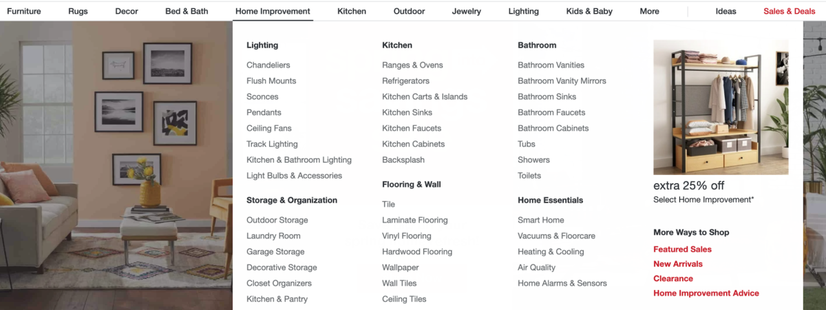
Source: overstock.com
Offer Directional Cues
Directional cues are another way to point your visitors in the right direction. They can be arrows or lines, and they should be pointing towards the most important element of a page. This is usually the CTA button, but you can direct your visitor’s gaze anywhere.
The one thing to note is that you shouldn’t be using too many of them on a single page. The purpose will get lost, and you’ll only end up distracting your audience.
Here’s an example from Landrover’s homepage. They have added an arrow to the bottom of their hero section, telling visitors to keep scrolling to uncover the rest of their offer and message.
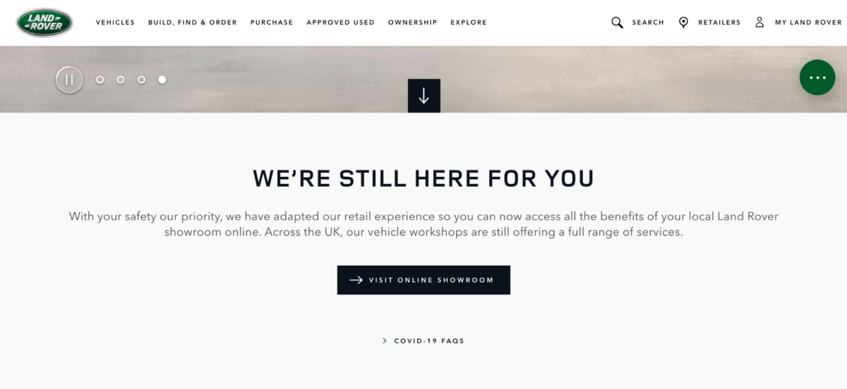 Source: landrover.co.uk
Use the F-Pattern
When weʼre looking at a website, our eyes move in an F-pattern. Thatʼs why using the same pattern as the guiding principle behind your page’s layout is the best way to give your visitors what they want and use their habits to your advantage.
This means you should be placing your most important items and your CTAs along that F shape, and all of your less important items in the bottom right corner of the screen. Align your content to the left, as opposed to centralizing it, and perhaps add less important info to the left-hand sidebar.
Establish Visual Hierarchy
Another point to bear in mind when considering the best way to structure your page is the importance of visual hierarchy. The F-pattern is just one example of how you can organize different elements. You can also use the Z-pattern, or you can do a more simple centralized layout.
What matters most is featuring the most important parts of your page as high up as possible. This includes your main message and the CTAs to your most important actions. For example, a sales page may also feature a newsletter signup button, but it should be located at the bottom, and by no means above the actual Add to Cart button.
Use Negative Space
Negative space, often referred to as white space, is the trademark of modern website design that also has a significant impact on conversions.
Do you remember the websites from the 90’s and early 2000’s, with the black background and white or colorful text, the flashing buttons and generally too much going on on the page? Well, white space is the negation of that. It helps create a clean, simple, efficient design that makes the visitor feel like they can breathe.
You don’t have to use white, though, if you find it makes the page look empty. This purchase order management page on inFlow uses both white and pastel shades to make the copy and the imagery stand out. The page is not cluttered but it isn’t boring either. There is plenty of action and movement on it.
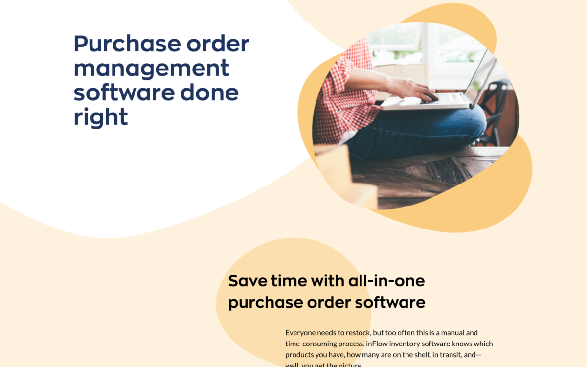 Source: inflowinventory.com
Keep it Simple
Finally, you want to keep the entire design simple, elegant, and clean. The less cluttered a page is, the more likely it is to provide an enjoyable user experience.
Consider the elements you want to add, and be very strict. Only use the ones that add real value: you don’t need a link to every category of your shop from every other category page. Keep your layout intuitive.
Don’t be too colorful either. Using vibrant colors is one thing, but making your website look like it has just been run over by a rainbow is quite another.
Be mindful of your audience’s tastes and preferences, and A/B test your main converting elements. After all, you may find some of your assumptions were wrong and that a completely different solution works much better.
Final Thoughts
Bear these design elements in mind before you jump into any expensive and extensive conversion optimization schemes. After all, how a website looks is often that all-important first impression that makes all the difference.


Top Benefits Of Helpdesk Ticketing System
Are you looking for the best ticketing system to render the best customer service? Then a helpdesk system is what you need at the [...]

Social Proof Best Practices: Leveraging Customer Relationships to Build Trust
Over the years, digital marketers have developed clever strategies to better inform, attract, and convert more prospects and channel the accumulated traffic into their [...]

Clutch recognizes Techzo as one of the Best Web Developers in Illinois
Let’s face it, having a website is quintessential in today’s digital world. The power of online presence is stronger than ever, and a site [...]