With a staggering 7.5 million blog posts published every day, it’s safe to assume that simply writing OK-ish content and doing a bit of SEO won’t cut it anymore. In fact, with that type of competition, even top-of-the-line writing holds the chance of falling flat. In particular, when it features an unattractive design.
You see, people don’t just want data and value. They also want to have a great time, whether they’re reading to learn something new or find a piece of information. The preference for well-designed content is so strong that 59% of people will prefer to consume content that looks great, vs. the 41% who’d choose something plain and simple.
Considering this tendency, it’s not a bad idea to think about using design to increase the effectiveness of your content marketing strategy. The following are the main aspects of design you should focus on
Color
When looking for design tips to bring your content marketing strategy to the next level, your first instinct may be to look at your color schemes. And, in most cases, that instinct may be correct.
Although entirely directing your content strategy according to color psychology may be taking it a bit too far, you still want to be sure you’ve picked colors that do an excellent job of representing your brand.
Moreover, the hues you’ve chosen must create a cohesive whole that’s aesthetically pleasing and draws attention to high-value elements.
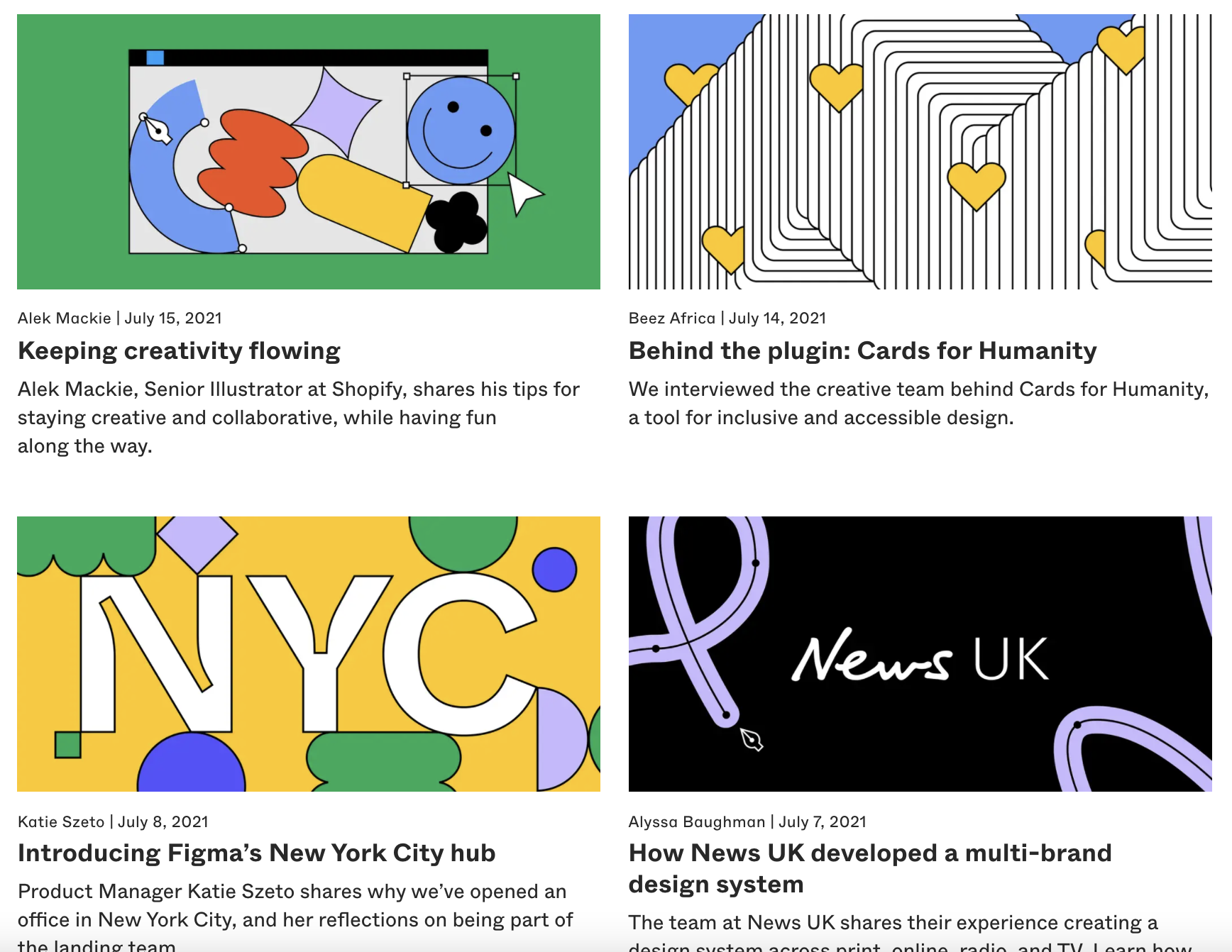
Figma is a brand that does color particularly well. If you check out the company’s blog, you’ll see that each article uses a custom feature image. And, it just happens that the shapes and colors on each of the feature images fully match the brand’s visual vibe. Thanks to this foresight, the content doesn’t just offer helpful info. It’s also an integral part of the brand’s entire identity.
Negative Space
While non-designers may think of colors and shapes when trying to visually improve their content, they rarely ever think about the effect of leaving things out. But, if you research the elements of good design (print or web), you’ll inevitably come across the concept of negative space (otherwise known as white space).
Essentially, negative space represents the blank space between and around visual elements, which allows them to be visually distinct from the background. Moreover, it’s the part of a design that ensures that the intended message is clearly seen by website visitors.
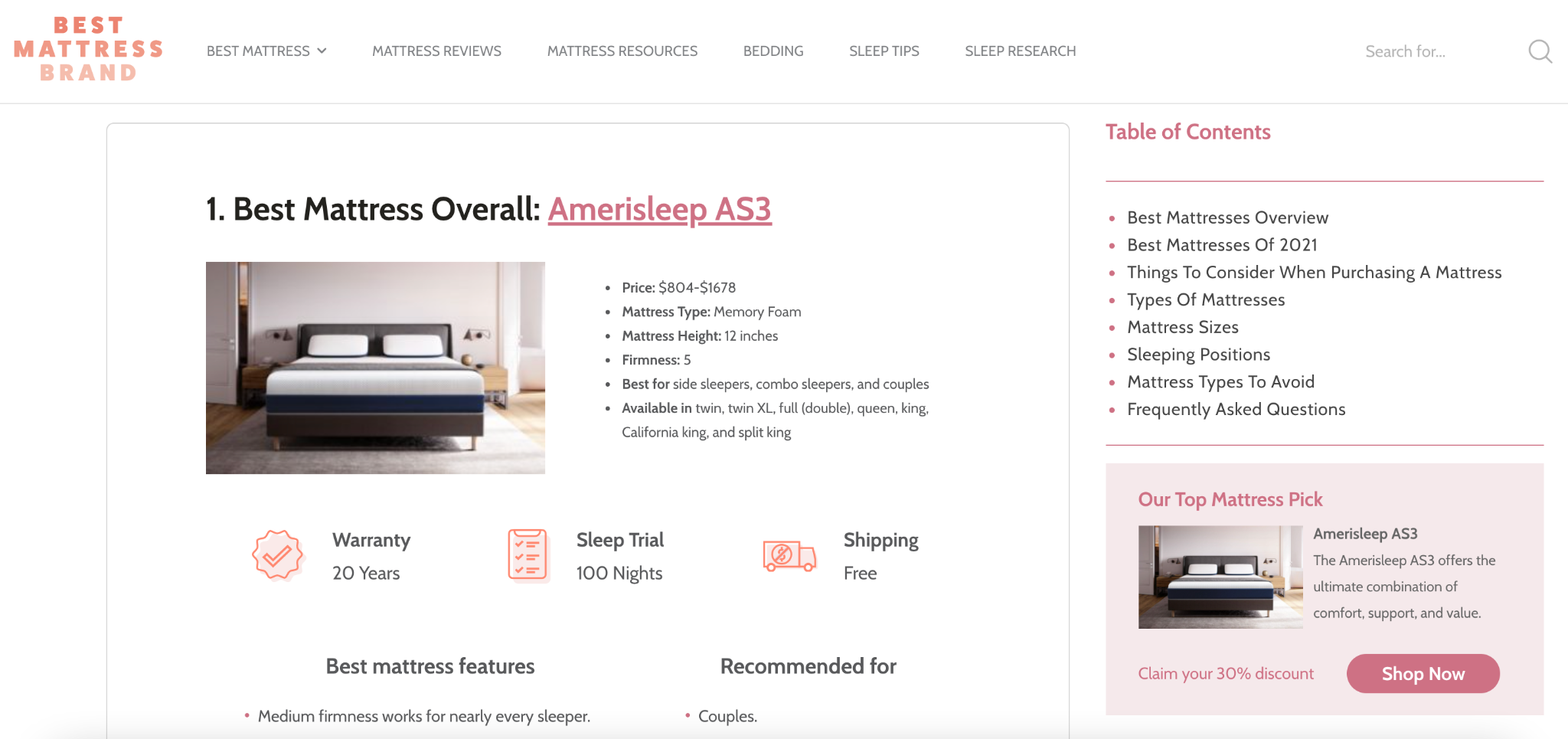
For content sites, especially information-heavy ones, using the right amount of negative space can go a long way. In this example from Best Mattress Brand, the design team chose to go in an almost minimalist direction, allowing for ample empty space between various elements. This achieves:
- a clean look
- high visibility of crucial product features
- a cohesive whole that directs user attention towards conversion boosting elements like CTA buttons
CTAs
While allowing for enough white space around high-value elements like calls to action ensures that web visitors hear the intended message loud and clear, it’s not exactly enough to drive above-average results.
That’s why CTA button design gets so much attention.
Seeing how the action you want web visitors to take is communicated through CTAs, your best bet would be to choose colors, shapes, typography, and messages that will allow this. Don’t go overboard, but do take care that your CTAs stand out against the rest of your content.
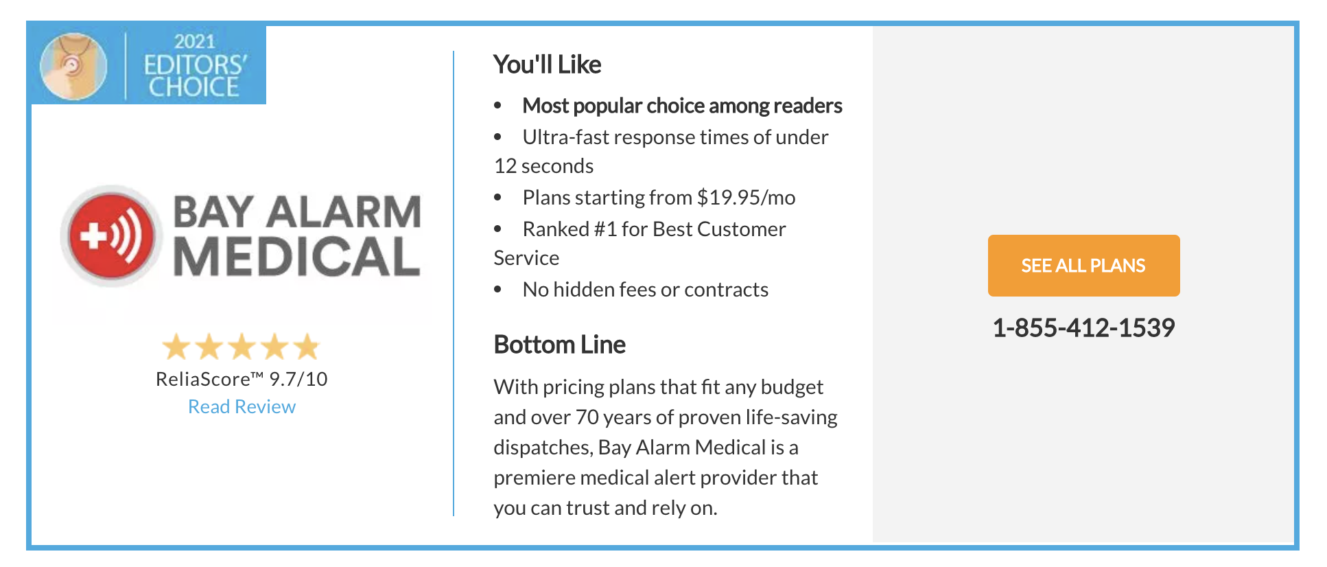
This example from Medical Alerts Buyers Guide is an excellent instance of implementing principles when designing CTAs. The button is:
- large enough to be seen immediately
- surrounded by negative space
- colored orange (which offers enough contrast with the blue and white)
- utilizing clear and concise language
Layout
When publishing content, you have to remember that most web visitors probably won’t read it in full.
Research from the Nielsen Norman Group shows that the average website visitor only reads about 20% of the text on a page. Furthermore, eye-tracking data shows several patterns, which most internet users use when reading content online. These include:
- F-pattern
- Layer cake pattern
- List bypassing pattern
- Section bypassing pattern
- Spotted pattern
- Commitment pattern
- Zigzag pattern
- Lawnmower pattern
Knowing that web visitors use these reading patterns, you can make design choices that will improve user experience and direct reader attention to the right elements.
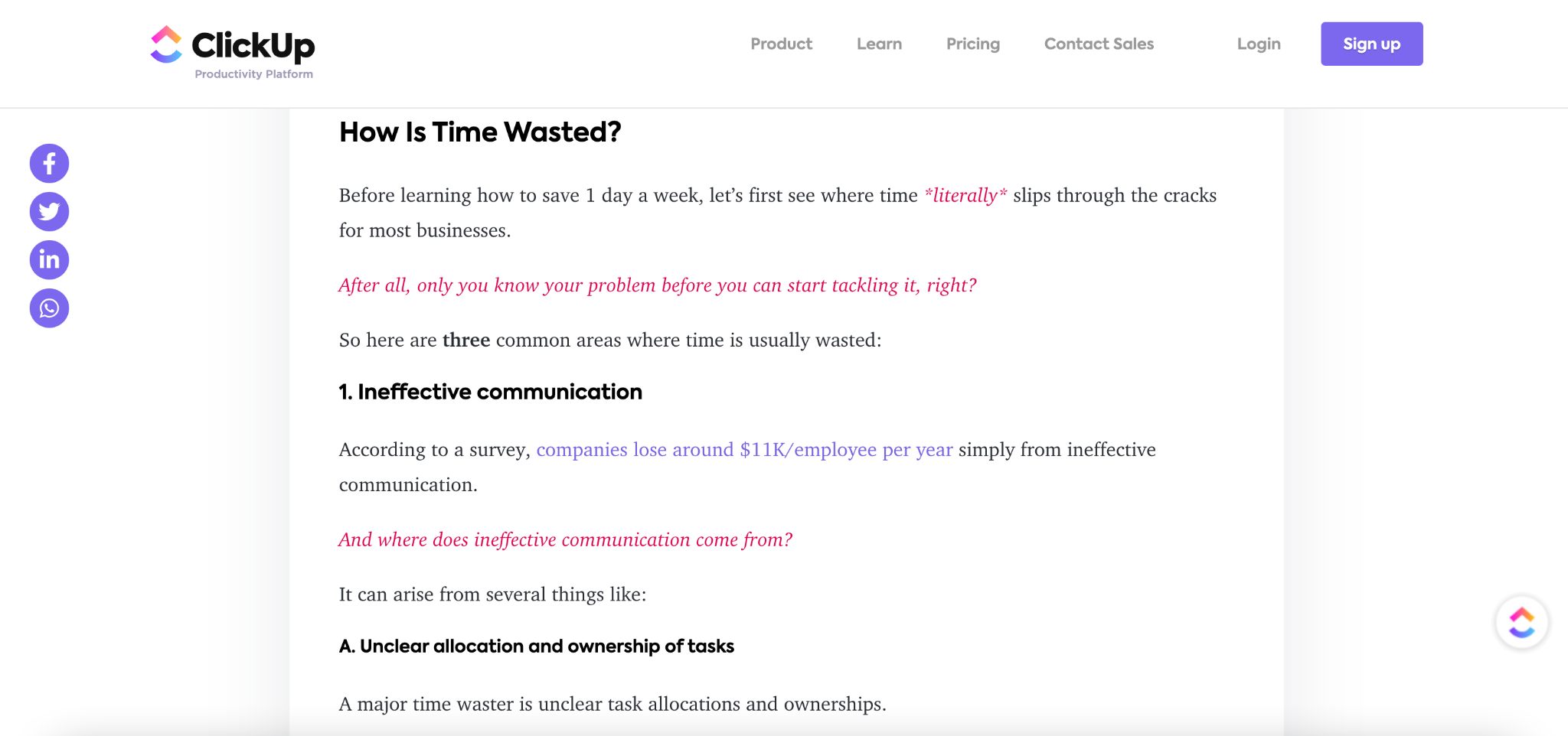
So, instead of writing in a single block of text, try to break up your paragraphs. Moreover, add visual cues by using heading styles, emphasizing key concepts, and formatting your text in a way that works well with people’s preference to skim.
For a good example of how to do this, check out Click Up’s blog section. The brand manages to present a lot of information in a visually exciting way.
Images
Before you’re done designing your content pages in a way that’ll awaken positive reader reactions, don’t forget to add some imagery.
Pictures can be not only highly efficient communication tools but also a great way to enhance your written content. For example, you can use them to illustrate points. Or provide additional information. And even if you feel like those are unnecessary, adding an image to your blog can help set the tone of your posts.
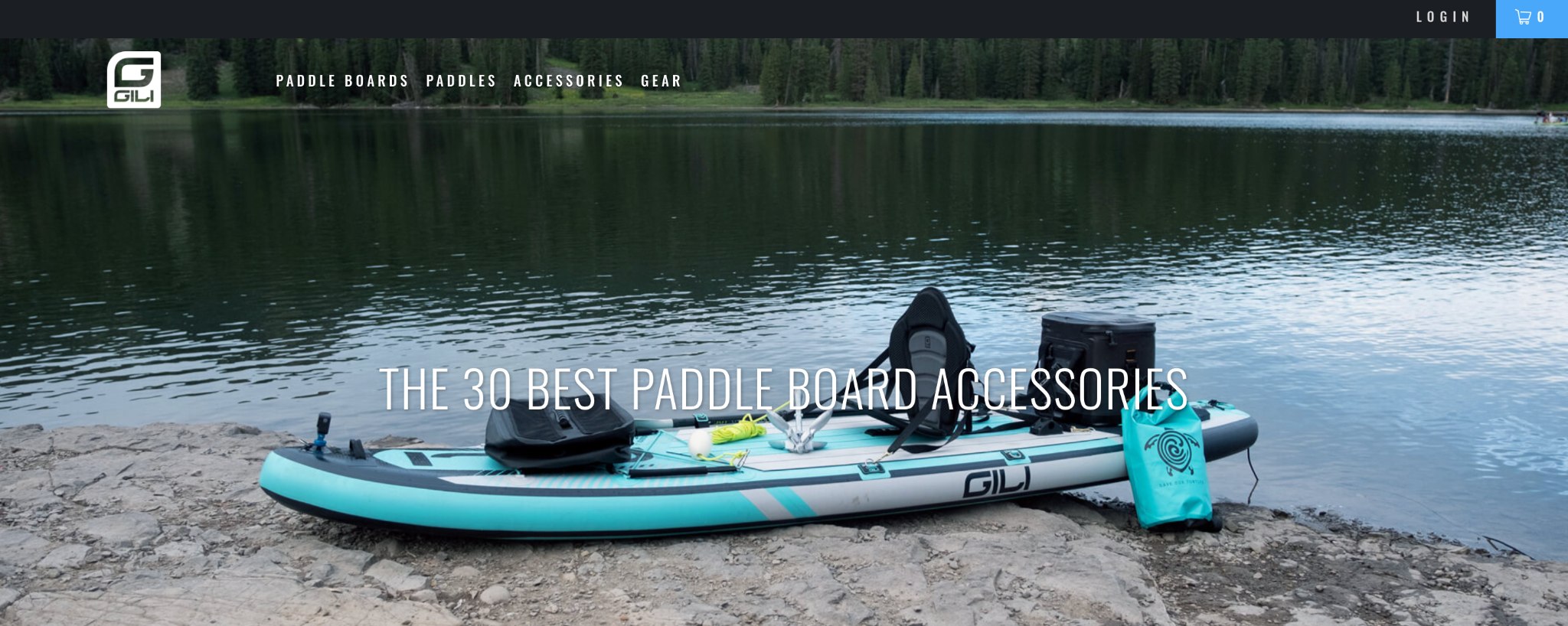
If you check out this post by GILI, you’ll see that the main visual isn’t a direct representation of the products the blog post covers. But, it does a great job of setting the tone. It’s made to appeal to paddleboarding enthusiasts who wish to become even more immersed in the lifestyle.
Illustrations
For some content, just text will be too plain, but images will be too much. In these cases, it’s good to implement some form of visual element that’ll direct reader attention without being a distraction.
In these cases, illustrations (or icons) can help enhance your brand’s content marketing without coming off as tacky.
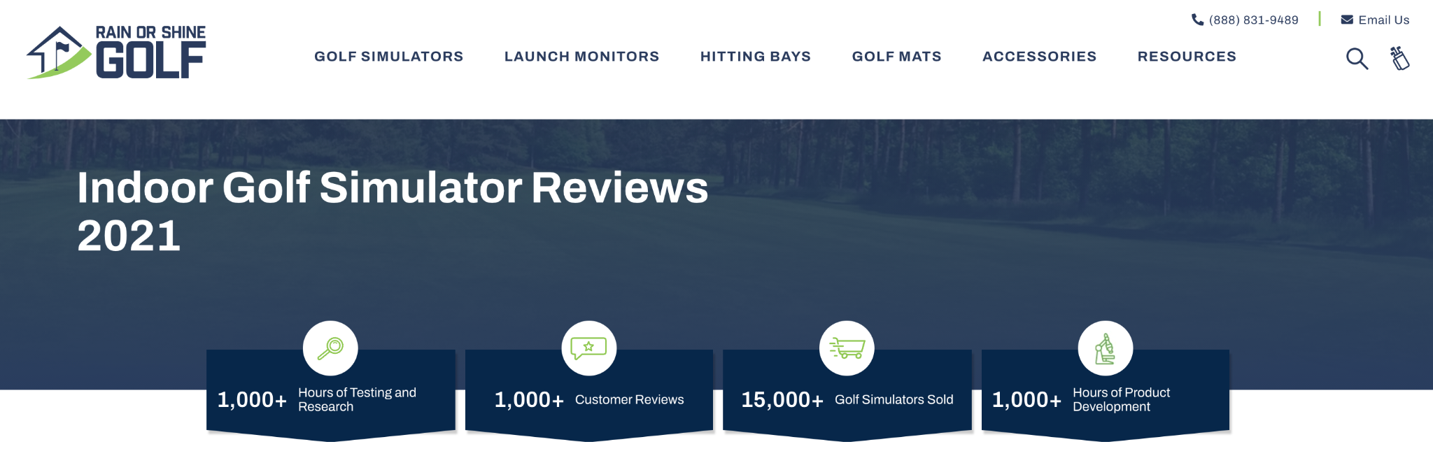
For a good example, check out the Rain or Shine Golf website. You’ll see how the brand uses icons to communicate trust-inspiring info, like the number of reviews they have or the amount of time they’ve put into researching and testing products.
Typeface
Just like images or illustrations, the typeface or font you use can say a lot about your brand. For example, using Helvetica will help you communicate a classic, clean approach to getting things done. Using a Bodoni typeface, on the other hand, is more likely to emit a posh vibe.
When choosing a typeface for the content you publish, a good rule of thumb is to go with fonts from the same typeface family. If you hired a professional design team to do your visual branding and design your website, try to stay true to the choices they’ve already made. However, if you’re taking the DIY approach to content marketing, just make sure you don’t go overboard with gimmicky fonts.
Gestalt
Finally, to really bring your content to life, try to keep in mind the Gestalt principle. The theory proposes that the human brain wants to simplify and organize complex images by subconsciously creating organized systems that represent a whole instead of separate elements.
When publishing content, Gestalt can be a great guiding principle as it helps effective brand message communication.
For example, if you want to represent several ideas as part of a whole, place them next to each other. Or, if you want to connect different ideas, you can use same-color elements to bring them together.
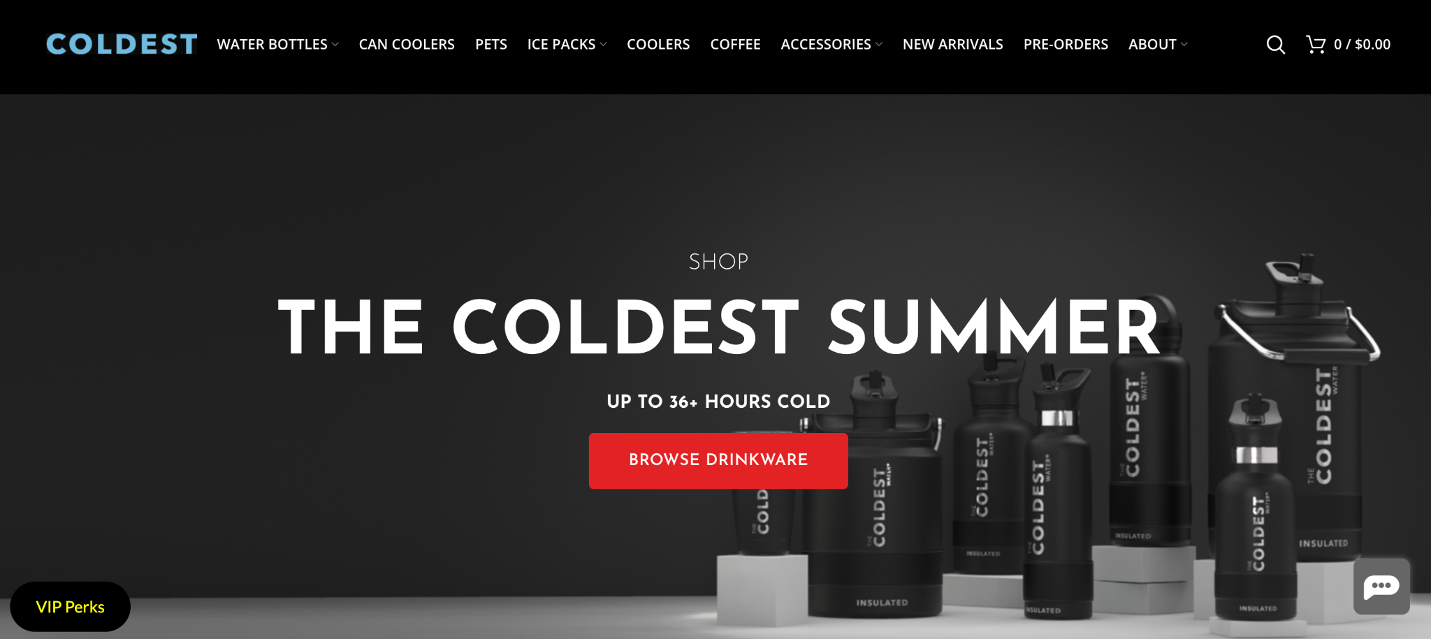
For a great example, check out the Coldest homepage, which features a variety of products in the same color. This creates an effect of uniformity despite the items in the images being different from each other.
In Closing
As you can see, there’s a lot you can do to elevate the visual appearance of your content. And while it may seem like a lot of work, rest assured that it’s definitely worth the investment.
A clear visual direction won’t just testify to the strength of your brand. It will also ensure that your marketing messages come across in the best possible way. Plus, it will encourage your target audience to develop positive brand associations.
So what are you waiting for? Get down to work and start making your content look more beautiful.
Related Resource: Business Analysis Models


Top Benefits Of Helpdesk Ticketing System
Are you looking for the best ticketing system to render the best customer service? Then a helpdesk system is what you need at the [...]

Social Proof Best Practices: Leveraging Customer Relationships to Build Trust
Over the years, digital marketers have developed clever strategies to better inform, attract, and convert more prospects and channel the accumulated traffic into their [...]

Clutch recognizes Techzo as one of the Best Web Developers in Illinois
Let’s face it, having a website is quintessential in today’s digital world. The power of online presence is stronger than ever, and a site [...]