
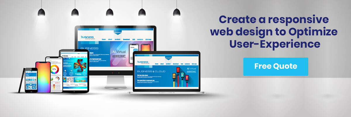
In today’s dynamic world, we hardly see any individual who is offline or not available through internet access. In today’s dynamic era a website is not just viewed by a random user using an internet connection on his desktop computer but usually, nowadays people view it on their cellphones. It was studied and founded by EMarketer, MCommerce sales for the US retail will be increasing with every coming year. Itself this is very alarming and marketers and businesses should really capitalize on this situation. As a matter of fact we believe that businesses and firms should seriously consider optimizing website accessibility and should enhance the user experience on tablets, smartphones and every device that is possible just because it is of vital importance that now and in the upcoming days it is very important to be universally accessible and available on every platform offered to the user and in order to stay updated and customer relevant. In order to retain your target market and to accommodate users websites which were impressively developed and designed in a way that it was responsive and was also comprehensively the best possible desired solution at the time.
A responsive design is not just the user interface or the understandable website items but it means how a website is planned, designed and developed in order to have appeared optimally and to be responsive at the same time. It simply means that the page loaded on the screen should be readable, usable and easy to navigate along with least panning and scrolling allowing users to use it easily and the page should be highly responsive. A responsive design is not just something to be done and treated as just a method or technique, but it is a basic and essential idea of how a website should be designed and built simultaneously.
A Responsive and Interactive Web Design?
A responsive web design is a professional and channelized rigorous development process which enables a website design to be easily accessed and used with ease and proper accessibility provided to the user regardless of what device is being used to access the website be it a tablet, PC or a cell phone. In short, it makes the design adapt and adjust accordingly hence it makes it a lot elastic and easier to use.
Whereas a responsive design is concerned, a cascading style sheet (CSS) which basically defines a format and a layout of a web page are privileged to allow a website to accommodate according to the size and width of the screen of a browser, regardless of what device is being used to optimize the screen. Javascript and js libraries, for example, JQuery and Modernizr are additionally used to go with this conduct for resizing more powerful protests like workmanship exhibitions and also changing over mouse exercises to touch exercises.
Except for mobile detection and adaptive design, the CSS media questions are utilized to decide things like the elasticity, size, and introduction of the gadget screen i.e. your browser.
Basic and Initial Essentials of Responsive Design
Basically, there are two types of responsive designs, which are breakpoints and fluid scaling.
Breakpoints
CSS3 media questions make contingent limits at which the width of a particular gadget composes program will then trigger exchange styles. Here at Techzo LLC, we, for the most part, utilize greatest width breakpoint, to make a work area first (downsize) assemble versus a base width limit, for a versatile first (scale up) manufacture. Inquiries can likewise be utilized to decide stature and even gadget introduction.
Breakpoint sizes (we’ll utilize widths starting now and into the foreseeable future) can be set in px or em. The separation in present-day programs is unimportant, however, contrasted with a couple of years back. Breakpoints can be set at any size however they have a tendency to line up with the most widely recognized measurements of every Desktop, Tablet Portrait, Mobile Landscape, and Mobile Portrait. As a rule, these have a tendency to be 1200/960px, 768px, 480px, and 320px, wide separately, however, industry models are continually changing as there are new gadgets being introduced simultaneously.
From the past years, these type of devices has incorporated to mix into each other, particularly with the presentation of retina shows. Accordingly, you may get to know that the two devices can work together at the same breakpoint (i.e. tablet scene and workstation) yet it may likewise find that a specific gadget has an exceptional size, so is the place the following guideline becomes possibly the most important factor.
Fluidity
Fluid scaling can be accomplished in a couple of various ways, yet it will dependably include rate or esteems to allow a compartment to scale inside the limits of its parent components, and eventually the program. Fluid scaling is important to accomplish responsiveness between breakpoints, to expand your land, and in addition to stay intact with the streams of segments in a pretty responsive way.
A basic case of a fluidly scaling item would be an HTML page comprising of one square with a width of 100% and a statue of “auto”. As the program changes width, the square scaled along with it, accordingly. Where you apply this scaling at the level which is dependent upon you, however, smoothness ought to dependably exist at the best level of any responsive holder.
Another prevalent case of fluidity is a network design. In a network format, virtual squares are adjusted and equitably dispersed over the width of the body of a site or holder. These squares are settled in width, adjusted as inline-hinders, with a parent holder which is fluidly scaling. By doing this, when the program (and eventually, the compartment) achieves the time when the whole of all squares surpasses its patent holder, the squares break to the following line. These squares are alluded to as sections and each square could likewise speak to various segments.
For example, in the event that you have 3 squares, they could speak to 9 sections, at 3 segments each. Once you’ve downsized to a width that fits 2 obstructs, at 3 segments each, with the third on the following line, you’re presently looking at an 8 segment design, with 2 sections of edge. Scale down further to finish off the edge and you’re looking at a 6 section design with no edge.
Designs
Grid layouts may likewise be utilized over a whole site, including sidebars and body content. Subsequently, numerous sites are outlined on matrices, spilling out of left to right, through and through (simply like Germanic and Latin-based composed dialects).
With a specific end goal to display the ideally responsive design for a matrix, we begin by choosing the known gadget widths from our insight into breakpoints. Utilizing these figures, we ascertain the closest figure of the site width and number of segments, which partition into the best number of entire variables. We should do this without trading off the substance’s land much (so don’t go over the edge).
One of the most inspiring and amazing 960grid framework, which is regularly utilized in 12 sections. Two one next to the other squares taking up the full width of a page is in this manner every 6 and 6 segments individually, in a 12 column grid.
When planning and creating for responsive web design, we put a great focus on holding the structure and request of components from the desktop through cellphones. This permits fluid scaling while also reducing the unnecessary load of duplicate elements that are covered up or appeared at particular breakpoints.
Responsive Design at our Designing Agency
At our agency, our 2013 standards for responsive design includes choices for a standard 960 network, requiring outlines for work area and versatile, and also a widescreen 1200px or 1280px matrix requiring plans for desktop pc, tablet or 960, and cellular phone. Every between time organize is either snapped by means of breakpoints, to the following breakpoint measure, or fluidly scaling – the unpredictability of the plan and extent of the undertaking will manage that choice.
Our capable advancement group incorporates full stack engineers and also frontend authorities, every one of whom is prepared in responsive practices and are assessed on a quarterly premise. We perform quality checks of all the real programs and previously mentioned breakpoint widths both physically and utilizing an exclusive screenshotting administration worked off of PhantomJs, and additionally with manual gadget testing with our in-house QA engineers.
Optimizing User-Experience
Regardless of your industry or the items and administrations your organization offers, client encounter on your site ought to be absolutely critical. With responsive development and design, your gathered audience and target market of people will dependably have the capacity to connect flawlessly with your site on every one of their gadgets, at any given time. Cellphone and tablet utilization is ending up increasingly predominant, and to prevail with your online existence, presence, and acceptance amongst users, the website should be enhanced as well as upgraded for those gadgets and their clients who use it frequently and more often.


WHY USE WORDPRESS FOR YOUR WEBSITE
WHY USE WORDPRESS FOR YOUR WEBSITE WordPress tool is free to install and use. This helps to create blog, edit, [...]

How significant is a Blog Search on Your WordPress Website
How significant is a Blog Search on Your WordPress Website It is also beneficial in the lead generation, and to boosts [...]

Why you should hire a Word Press Developer
Why you should hire a Word Press Developer Word press is a free and open source blogging tool and a content [...]


