If you want to maximize conversion rates, your online store needs awesome product pages. There’s simply no getting around this fact.
All your combined marketing efforts – everything you do to generate traffic and build and nurture leads – lead up to the sales pitch made on your product pages.
This is where the magic happens.
This is where the details of your amazing product are presented in a way that makes the visitor either go: “Yeah! This is something I can’t live without!” or “Meh, I think I’ll keep looking.”
In this article, we’ll take a look at tactics successful ecommerce sites are using to convince their visitors to become customers.
1. Don’t Hold Back on Unique Selling Points
The things that set your product apart from your competitors need to be screamed from the virtual rooftops. This is information that cannot, under any circumstances, be hidden from your potential customers.
Solving this issue comes down to two separate but integrated issues: copywriting and design.
From a copy perspective, your USPs need to be concise, clear, and extremely convincing. Think about them as a summary of the reasons customers should choose your product over the massive amount of options the internet has to offer.
From a design point of view, your USPs need to be visible and engaging. They have to jump out of the screen without detracting from the main call to action (CTA).
One of my favorite examples of a product page that perfectly combines great writing with excellent design is from Transparent Labs.
The nutritional supplement retailer dedicates a sizable section of real estate to their products’ USPs, splitting the information into two vertical sections.
The left-hand side shows a visual summary of the four main points they want to communicate, making this info even more accessible with the excellent use of iconography.
On the right-hand side, the visitor sees a more detailed text that delves deeper into the product’s range of benefits.
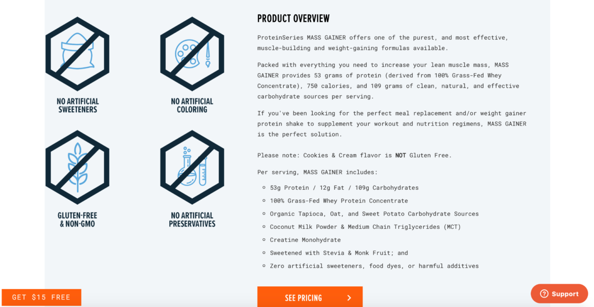 Image Credit: transparentlabs.com
This is USP communication at its finest. The site accommodates users that skim-read the page’s content but also provides detailed info for those who are intrigued and want to learn more.
2. Embrace Negative Space
Like I said before, a product page exists to drive and facilitate a decision – no other reason.
Visual elements that don’t play a role in this objective have no business being on the page. They distract the visitor from the content you want them to see and interact with.
This principle is doubly important above the fold. This is prime real estate that must be absolutely free of visual clutter.
What’s important to note here is that the term “clutter” doesn’t only refer to interactive elements like buttons, dropdowns, and other standard UI controls. I’m also referring to complex, busy background imagery and color schemes.
Product pages that avoid visual “busyness” and embrace empty space surrounding the important elements are said to be using “negative space” wisely.
Brutal simplicity in a page’s visual composition means that your visitors’ eyes remain focused where you want the focused – the elements that convince them to become customers.
Take a look at how much white space is visible on Elemental Labs product page. It’s a thing of simplistic beauty, and not just above the scroll line.
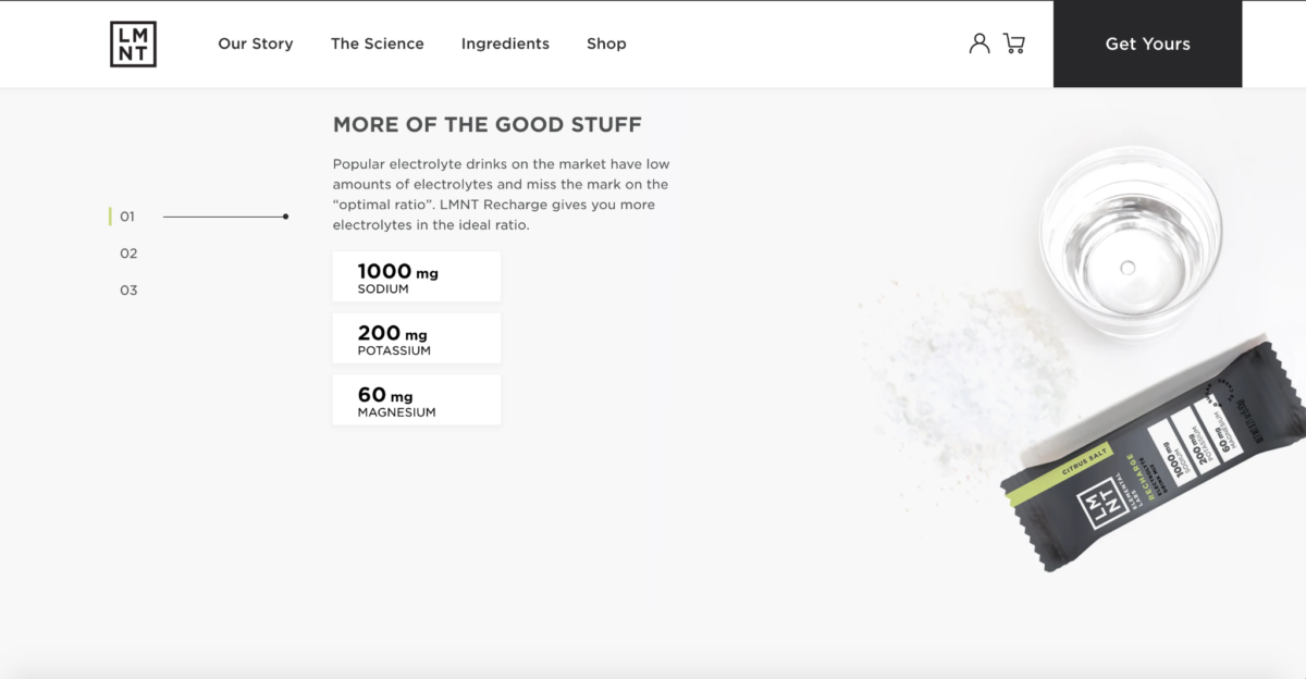 Image Credit: drinklmnt.com
The minimalist aesthetic remains a feature from top to bottom – and the page is all the more effective for it.
3. Get the Most Out of Your Image Gallery
What if I told you that there’s SO MUCH MORE you can do with your product’s image gallery than simply the standard approach of showing it off from all angles.
Sure, giving your visitors a proper look at your products is the gallery’s primary goal. Don’t forget this. First, do all the basics right before “branching out” with your gallery:
Black for Luxury and Elegance
- Use high definition images.
- Allow users to zoom in on the photos.
- Include other objects to create a sense of scale.
- Show people using or wearing the product.
Once you’ve got these down, you can start getting creative with your gallery.
Let’s take a look at a product page from Joi’s plant-based milk replacement, which seriously knocks this tactic out of the park.
Joi’s image gallery ticks all the best-practice boxes, and then some! The first batch of photographs depicts the product in the most obvious way. In subsequent images, though, things get super creative.
The company shows the product’s packaging against beautifully designed backgrounds that creatively feature the primary ingredients – almonds, in this case.
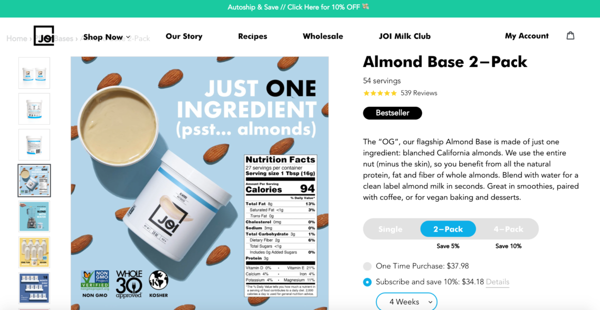 Image Credit: addjoi.com
The brand also chooses the image gallery, one of the most prominent areas of any product page, to feature additional information on the item.
The gallery shows the product’s ingredients, preparation suggestions, the most important USPs, and its many uses all in a beautifully engaging, visual way.
When it comes to your product gallery, think outside of the box. It’s not just a space to showcase the physical product in a typical context. This is your space! You can do whatever you want. Just remember to keep the visual info relevant and engaging.
4. Address Common Ecommerce Concerns
Even the most experienced online shoppers can experience a bit of anxiety when they have to transact with a new online store.
Feelings of hesitation and stress are the LAST things that a store owner wants their target audience to feel as they browse a product page.
Some of the most common concerns that first-time shoppers feel are:
- Exorbitant, hidden shipping costs
- Practical hassles with returns
- Transactional security
- The production process’s environmental impact
- The availability of a preferred payment method
These nagging concerns in the back of a visitor’s mind are all obstacles to conversion. And the job of the product page is to destroy every single one of the things that stand between a visitor becoming a customer.
Baja hoodie retailer, Orizaba Original, shows us an elegant and super unobtrusive way to solve this problem. Just take a look at the four icons cleverly placed right below the primary CTA.
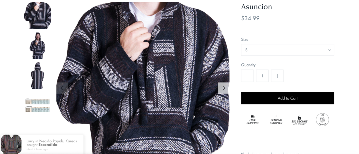 Image Credit: orizabaoriginal.com
In an area no wider than 300 pixels, four of these frequent concerns are addressed. The site doesn’t go into much detail on HOW each of these issues is dealt with. Words are kept to a minimum. But what Orizaba shows is that they KNOW that these are valid concerns and that they’ve got a solution for them.
They’re illustrating respect for the shopper’s state of mind – something that buys them a ton of goodwill and trust.
A for payment options, scroll down to the footer of the product page. Many customers, quite justifiably, feel that the more payment options offered by an online retailer, the more secure their transaction environment is and the more trustworthy their business practices are.
Which makes sense. Each time a website applies for a partnership with a reputable payment vendor, there are security and business audits to be done. The likes of VISA, Apple Pay, MasterCard, PayPal, and Google Pay don’t just get into business with anyone.
Wrap Up
The process of improving your product pages should be an iterative one.
Sure, as you read articles like this one and compare examples to your site, you may spot several changes that you want to make immediately.
While this isn’t a terrible idea and may even result in an instant boost in your conversions, ask yourself how you’ll know which change was the one that had the biggest impact?
Ask yourself if it’s possible that one of these changes had a negative impact on your conversions?
To solve this dilemma, simply implement each change separately. This way, you’ll be able to map changes in your conversion figures to a specific version of the product page.
Once you’ve built up a solid sample size and you’re certain that a specific implementation has improved your conversion rate, start planning your next implementation.


