Studies have proven that feelings triggered by color play a very important role in conversion rates.
In one particular case, adjusting the emotional targeting of a particular landing page led to a conversion rate boost of 24%. One of the ways designers did this was to adjust the site’s color scheme to something “more persuasive.”
In another study conducted in the 90s, neuroscientist Antonio Damasio proved that feelings are an incredibly powerful driver for decision-making. If you’re reading this article, it’s safe to assume your website exists to motivate your visitors’ decisions.
The connection between emotions and color (referred to as color psychology) means that it’s possible to make your target audience feel something very specific about your brand. And this concept can be harnessed to improve your site’s performance.
Let’s take a look at what different colors communicate to your users and how sites have leveraged these emotional messages to optimize conversion.
Green for Tranquility, Health, and the Environment
Before we get into the psychology of green, it’s important to note that it’s one of two colors that both men and women list as one of their favorites. This makes it a safe choice if your target audience includes a spectrum of genders.
Green is a color that communicates a sense of harmony and hopefulness. It triggers positive feelings of being connected with the natural world. It’s a perfect color to include on websites that sell products to nature lovers or people who seek to experience emotional tranquility and contentment.
Companies that sell health foods often use green not only in their website designs but also in the photographs depicting their products. Take a look at the Ultimate Meal Plans app home page for an example of this tactic.
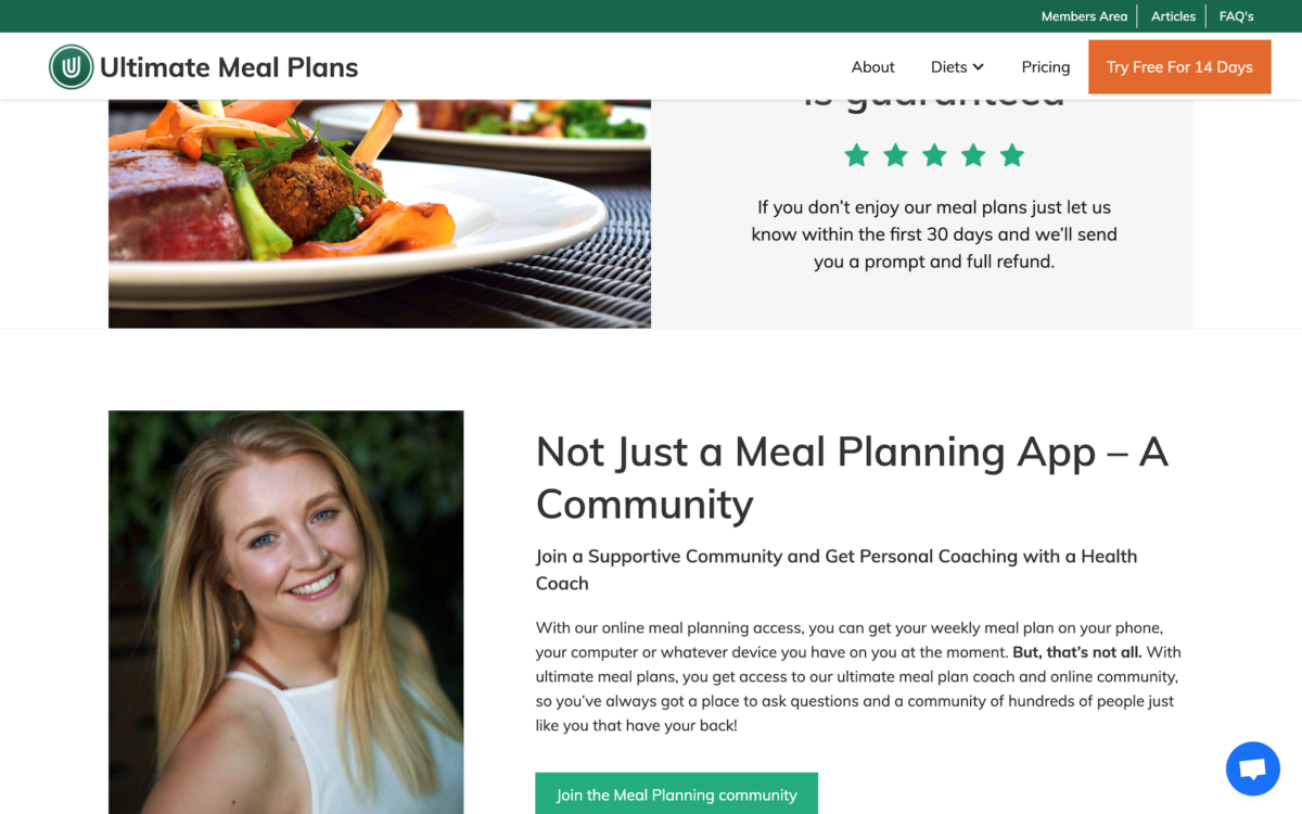 image source: ultimatemealplans.com
Green may be used sparingly on the site, but it’s by far the most prominent color (we’re not considering white as a color). The text headings are green and the hero header has a strong green component, but it’s in the product images that green really jumps out at you.
With only one exception, each of the meals displayed on the home page has a very strong element of green. This is an incredibly smart way to trigger the feelings the Ultimate Meal Plan consumers want to feel.
Travel websites that have an ecological focus also tend to use green for the same purpose. Five Leaf Travel is another good example of a company that uses green subtly but very effectively on its site.
Blue for Trust and Credibility
Blue is the second color that appeals to all genders, making it a great choice if you have a wide target audience.
The dominant emotions triggered by the color blue are trust, reliability, and credibility. This is incredibly helpful for companies that rely on their leads buying into specific claims. Especially if those claims involve finances and health.
Many companies have built their brands on the notion that their products are more reliable and trustworthy than their competitors’.
There are very few industries in which feelings of security and credibility play a bigger role in conversion than financial services. People take their money seriously. People, quite understandably, need their financial security to be taken care of by a company with impeccable credentials.
The same can be said for companies playing in the medical or health field. This is another topic where potential customers need to feel like they’re partnering with absolute professionals.
That’s why websites like Evolve Wealth and The Iatropolis Group liberally use blue in their websites’ color schemes.
Some sites cleverly capitalize on the emotions that blue triggers by applying the color to pages that are meant to convey credibility. For an example of this, look at the Ecopreneurist reviews page. The energy company is obviously very aware that testimonials in their field carry a huge amount of weight, hence their liberal use of blue here.
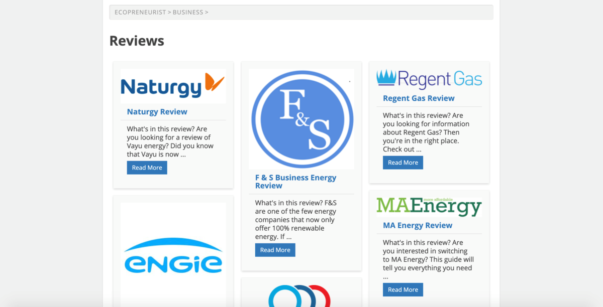 image source: ecopreneurist.com
Orange for Fun, Impulsiveness, and Creativity
Brands that want to shine a spotlight on their sense of humor and playfulness often have a warm, orange color scheme.
Orange is a color that appeals to the kid inside all of us. It’s a bright, fun color that makes us think of golden sunlight and triggers the desire to explore and be adventurous.
It’s not uncommon to find websites using a strong orange tone to also feature quirky, off-the-wall design elements. Take a look at Netrix Digital’s home page for a fantastic example of how orange was combined with a genuinely unique user experience.
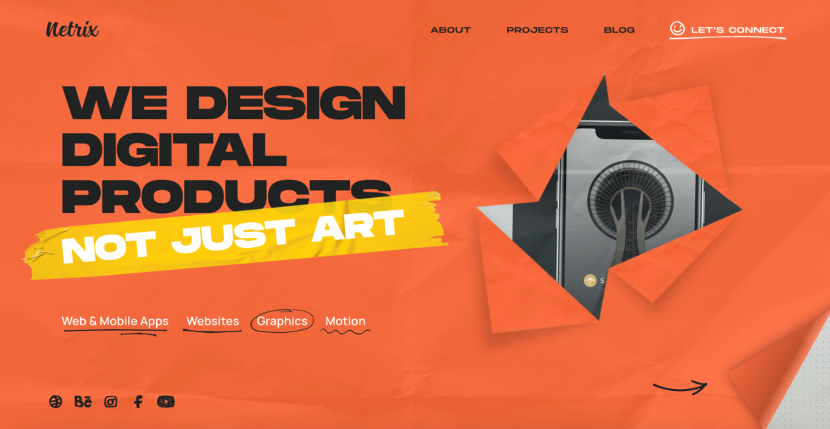 image source: netrixdigital.com
Playfulness is obviously a feeling the digital design studio wants visitors to associate with their brand. Using a strong orange color scheme is a terrific way to achieve this.
Bagigia is another company that embraces the combination of orange and a highly creative UX. The site has a super innovative navigational experience that is clearly aligned with the image they want to create for their brand.
Black for Luxury and Elegance
Sure, the jury may be out over whether it’s a color or not, but that doesn’t mean black can’t be used to generate feelings of authority, luxury, and sophistication.
According to TruConversion, the feelings created by using black can often be leveraged to trigger an impulse buy from a visitor impressed with the brand’s aura of exclusivity.
It’s a color that’s often used in the corporate colors of glamorous brands like Chanel, Louis Vuitton, and Conde Nast. And in most of these cases, black and other dark tones are very dominant on their websites, too.
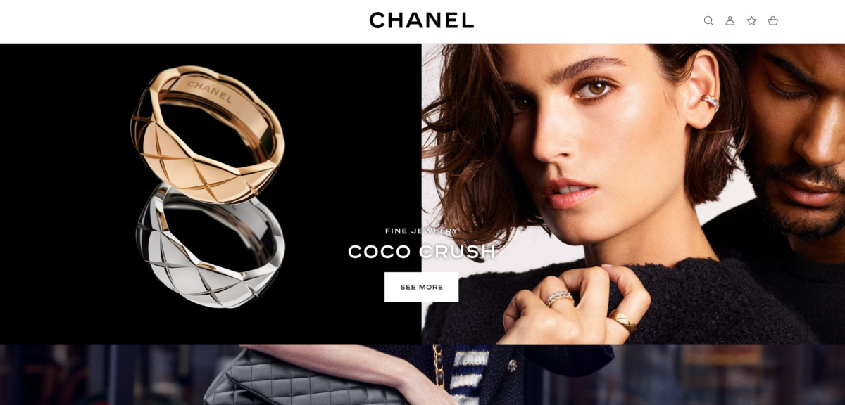 image source: chanel.com
Oftentimes the photographs depicting their products have low lighting with shadows accentuated. Negative space in these images is also mostly taken up by black rather than white.
Black has become so synonymous with feelings of exclusivity and luxury that certain brands use it liberally on their sites even though it’s not part of their corporate color scheme.
Take a look at Rolex’s website as an example. The watch manufacturer’s iconic gold and green logo is completely desaturated in certain places so that it synchronizes better with the site’s black color scheme.
Red for Energy, Urgency, and Attention.
Red isn’t often used as a dominant player in a website’s color scheme. Most experts feel that the emotions associated with it are somewhat negative.
However, this doesn’t mean red shouldn’t be used on a site at all. In fact, it’s an incredibly powerful conversion-driving color, outperforming green in this respect by up to 21% in certain niches.
Typically these messages relate to sales and special offers, especially if there’s urgency associated with these.
Booking.com offers us a really great example of how the color red can be used to snag the reader’s attention. One of the travel company’s most effective conversion mechanisms is their famous “Only 2 rooms left at this price!” message.
And guess what color this message is displayed in. That’s right – red. And to make this technique even more effective, this message is literally the only red element on any of the site’s pages.
Zoma also makes excellent use of red on their flagship mattress product page. As you’ll see, the general tone of the site is cool and quite desaturated. Most of the colors are subdued and sterile – except for the few areas where red is used to brilliantly grab your attention.
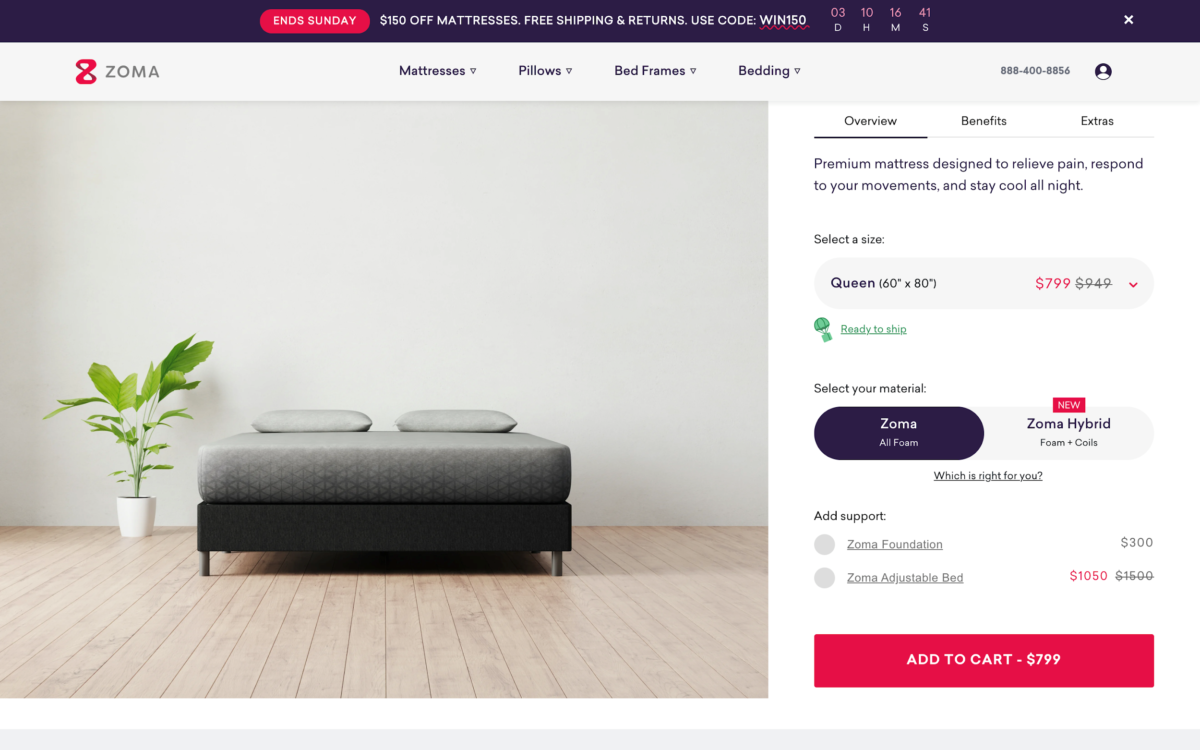 image source: zomasleep.com
Zoma uses red so sparingly and against such a stark background that the Add To Cart button virtually jumps out of the screen at you. The same can be said for the other elements that have been subtly but effectively “tagged” with the color.
Some Final Words on Color Psychology and Conversion
It’s important not to simply implement a new color on your website because you have a hunch that it’s going to resonate with your target audience.
Just like there have been studies and surveys linking certain emotions to colors, you need to conduct your own research into what your typical buyer personas want to feel when looking at your site.
Each company offers a product that addresses a particular emotion. Each brand speaks to a range of personas that are likely to share common emotional needs.
Conduct your own surveys. Talk to your customers. Find out what they want to feel about a product like yours and use this information to drive your design decisions.
Don’t make the mistake of thinking you can accurately guess what your audience needs – not with something as abstract as emotions.


Top Benefits Of Helpdesk Ticketing System
Are you looking for the best ticketing system to render the best customer service? Then a helpdesk system is what you need at the [...]

Social Proof Best Practices: Leveraging Customer Relationships to Build Trust
Over the years, digital marketers have developed clever strategies to better inform, attract, and convert more prospects and channel the accumulated traffic into their [...]

Clutch recognizes Techzo as one of the Best Web Developers in Illinois
Let’s face it, having a website is quintessential in today’s digital world. The power of online presence is stronger than ever, and a site [...]