Sometimes, despite our best original efforts, homepages get a bit stale. After all, design trends in ecommerce change over time, and audiences get used to different kinds of experiences. They may not take to your solution as kindly as just a couple of short years ago.
If you’re looking into different ways to revitalize your homepage, take a look at the five tips and examples we provide below. They may require a bit of effort, but they will inject some new life into your website and attract the attention of new customers.
Make It Simpler
Modern homepage design dictates simplicity and clutter-free homepages. Long gone are the days when it was perfectly acceptable to fill your pages with endless products, tons of copy, and your personal story.
For the best possible effect, consider which products are your most popular ones, and only show them on your homepage. This may seem incredibly limiting, but too many product carousels will simply be distracting.
Avoiding excess clutter will help you draw attention to the most important points. It will enable you to highlight the products you want visitors to see. These might be your most popular products, or you might want to showcase different categories, as opposed to individual items.
Take a look at how Lords and Labradors achieved this effect. Their homepage still features plenty of information, and it is incredibly visually rich. However, there is plenty of white space as well, and the page’s hierarchy is very user-friendly.
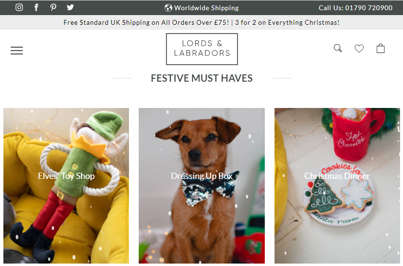
Note how they alternate between product and category. This allows them to give visitors a very firm grasp of the kinds of products they sell. Also, the Christmas and holiday product highlights are a great way to freshen up the page seasonally and provide something new for your regular visitors.
Use Imagery That Communicates Your Values
When you’re looking to revitalize your homepage, sometimes the simplest thing to do is look for some new visuals. Chances are that the current images were selected when the site was launched. Now is the best time for a refresh.
Instead of taking your usual approach to visuals, why not try to select photos that will help you communicate your values with your audience?
What is it about your brand that sets you apart and that you know your audience will be able to relate to? Are you carbon-neutral and passionate about the environment? Do you champion diversity?
Whatever your company values may be, try to showcase them via your new images. For instance, you can consider what Homestead Supplier has done. Their images feature their products, but they also have some product collages and feature some lovely images of domestic animals.
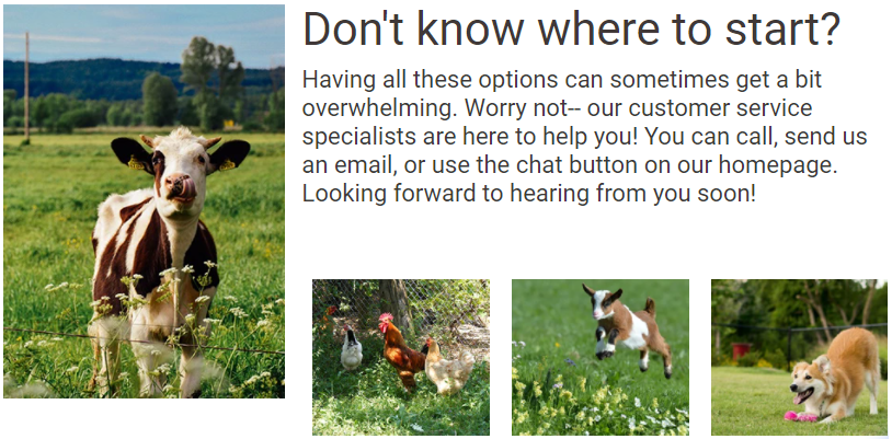
Their products are likely to appeal to an audience that is passionate about animals, loves nature, and prefers to do homesteading the old-fashioned way. The abundance of green in the brand’s images will certainly make them more relatable and easier to identify with.
Engage Your Audience with a Video
Adding a video to your homepage can be a great way to add another level of interest, deepen your message, share some additional information, or simply make the page more vibrant.
However, you will need to make sure that the video works, so to speak, as it can also prove to be not only ineffective but actually harmful.
First, you need to ensure that the video loads fast and that it does not slow down the loading times of your entire page. Visitors will not be interested in waiting, no matter how good the video is.
Also, you should always accompany the video with plenty of copy. Don’t force your visitors to watch it and provide nothing for those who prefer to read or those who are unable to play a video for whatever reason.
Finally, you want to ensure that you film something of interest to your audience. This can be a walkthrough through your collection, tips on how to use or style the product, and the like. While you may believe that the story of how you built your brand will make a fantastic video, audiences will more likely click on something that can benefit them than listen to two minutes of someone’s success story.
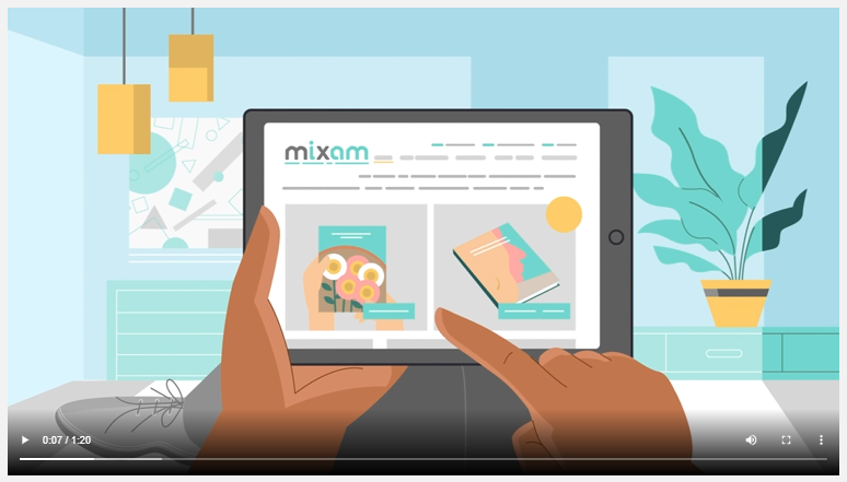
Mixam has, for example, filmed a couple of videos on the process of ordering their product. Since their process may be new to some of the customers, especially those who are ordering something custom-printed for the first time, this is an excellent way to eliminate some of the pain points and help visitors convert.
This is the level of usefulness you should be aiming for.
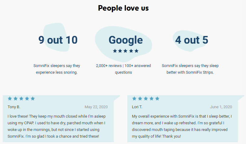
Draw Attention to Social Proof
If you currently have no social proof on your homepage, now is the ideal time to add it. Whether you choose to feature reviews (which we highly recommend), testimonials, or even case studies, they will add another layer of trust to the page. Plus, they’re a way to share some valuable information as well.
The key to selecting the right social proof is to consider what your target audience would like to see most. Are they worried about making a purchase from a brand that is new to them, or are they concerned about the quality of your products? Who do they want to hear from?
Before you choose the reviews to highlight, always ask yourself whether this person’s words will sway the majority of your visitors. If yes, it’s the right one to choose.
If your product is niche or unconventional, reviews can make a huge difference. Somnifix is proof of this. The reviews they’ve added to their homepage certainly help new visitors get over the “does this even work” issue they’re likely to come up against.
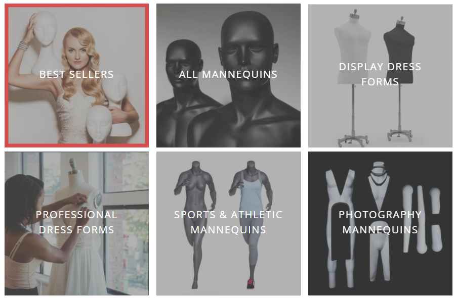
Showcase Your Products Visually
To revamp your homepage, you can also rethink the way you are showcasing your products. Consider putting them front and center so that shoppers won’t have to click around the site to get an idea of your offer. They will be instantly introduced to your best products and can get a firm grasp of what to expect.
Again, you want to choose the products that are most likely to be bestsellers and products that best illustrate what the rest of your stock is like.
Mannequin Mall has done this to great effect, as customers can instantly see what their products look like and determine whether they will fit into their store’s needs. They also need fewer clicks to convert, which is another plus.
Final Thoughts
Whenever you’re making a design-related choice, always make it from a user experience standpoint. Consider what your shoppers will want to see. Remember: just because you like a certain solution doesn’t make it the right one.


Top Benefits Of Helpdesk Ticketing System
Are you looking for the best ticketing system to render the best customer service? Then a helpdesk system is what you need at the [...]

Social Proof Best Practices: Leveraging Customer Relationships to Build Trust
Over the years, digital marketers have developed clever strategies to better inform, attract, and convert more prospects and channel the accumulated traffic into their [...]

Clutch recognizes Techzo as one of the Best Web Developers in Illinois
Let’s face it, having a website is quintessential in today’s digital world. The power of online presence is stronger than ever, and a site [...]